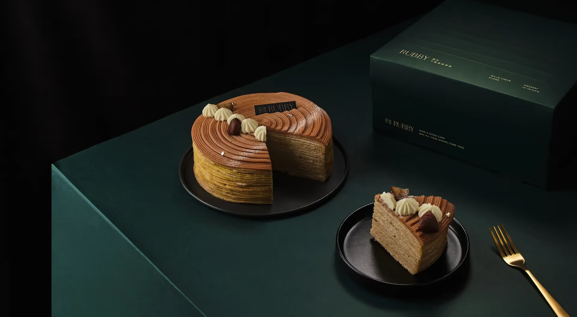
Rubby Branding & Packaging
我們的設計理念是以千層蛋糕片的層層堆疊為形象,來展現Rubby專業千層手作的獨特之處。
這個概念象徵著Rubby的精湛技藝和對細節的追求,同時展示出千層蛋糕層層疊疊的豐富口感。
在Logo設計中,我們將使用深藍和淺米色的顏色搭配。深藍代表著專業、高品質,彰顯Rubby的專業形象。而淺米色則象徵著細膩、溫暖和自然,呈現Rubby手工製作的甜點所散發的溫馨感。我們將以千層蛋糕片為主要圖像元素,將其層層堆疊,展現出層次感。這個圖像將以簡潔而現代的方式呈現。同時,我們使用優雅的字體來呈現Rubby的品牌名稱,以突顯其優雅氣質。
我們的目標是創造一個簡潔、現代且優雅的品牌,以千層蛋糕片的層層堆疊和深藍、淺米色的顏色組合來代表Rubby專業千層手作的品牌特色,突顯品牌精神。

Our design concept is centered around the imagery of layered slices of mille-feuille, showcasing the uniqueness of Rubby's professional handmade creations. This concept symbolizes Rubby's exquisite craftsmanship and attention to detail, while also highlighting the rich texture of the layered mille-feuille.
In the logo design, we will combine deep blue and light beige colors. Deep blue represents professionalism and high quality, emphasizing Rubby's expertise. Light beige symbolizes delicacy, warmth, and a natural feel, reflecting the cozy atmosphere emanated by Rubby's handmade desserts. The main visual element will be the layered slices of mille-feuille, showcasing a sense of depth and layering. This image will be presented in a clean and modern way. Additionally, we will use an elegant font to represent the Rubby brand name, accentuating its refined qualities.
Our goal is to create a clean, modern, and elegant brand that represents Rubby's expertise in handmade mille-feuille. The combination of layered mille-feuille slices and the colors deep blue and light beige will serve as distinctive brand features, highlighting the brand's spirit.