CHIMEI Product Catalog
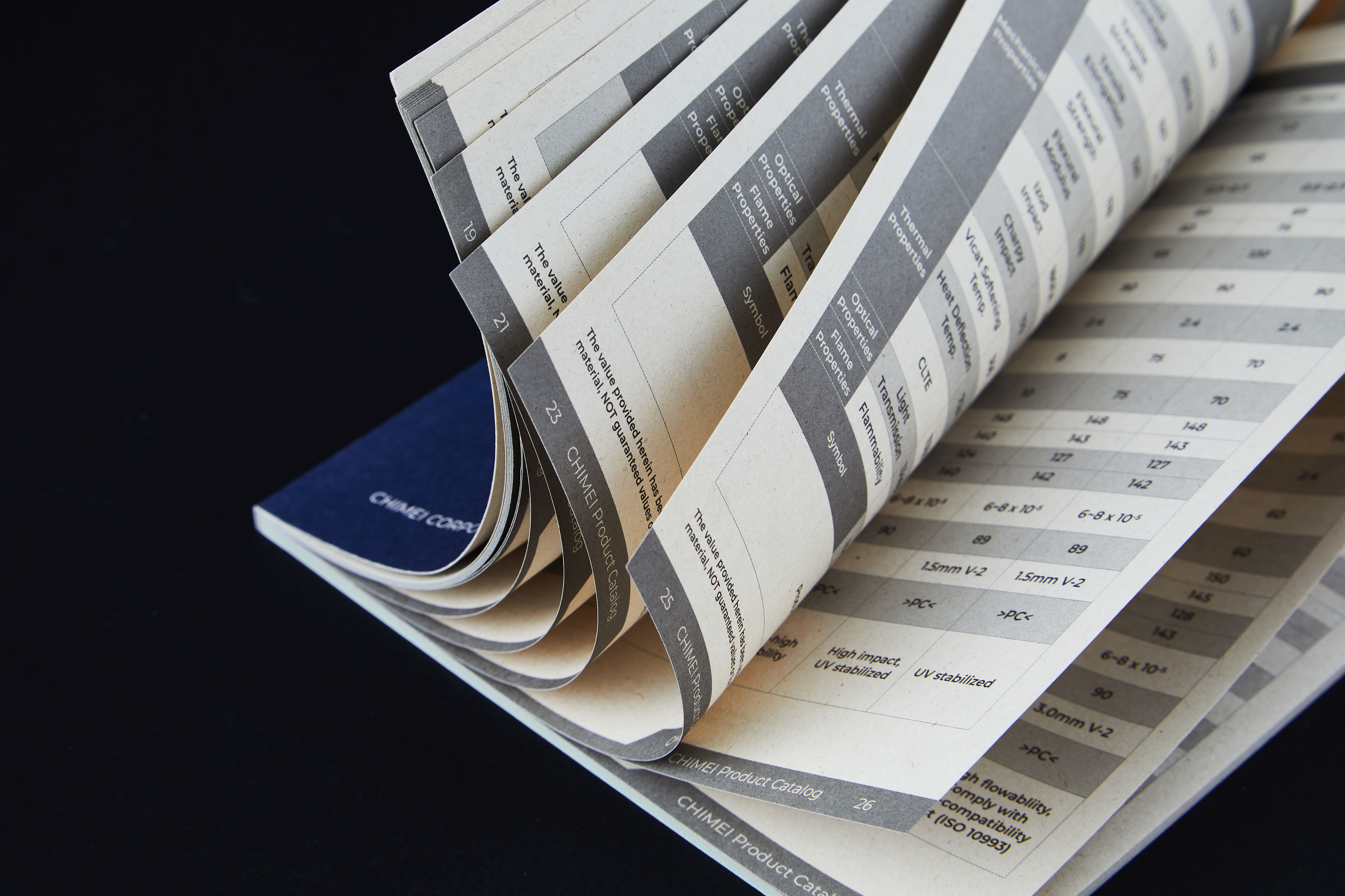
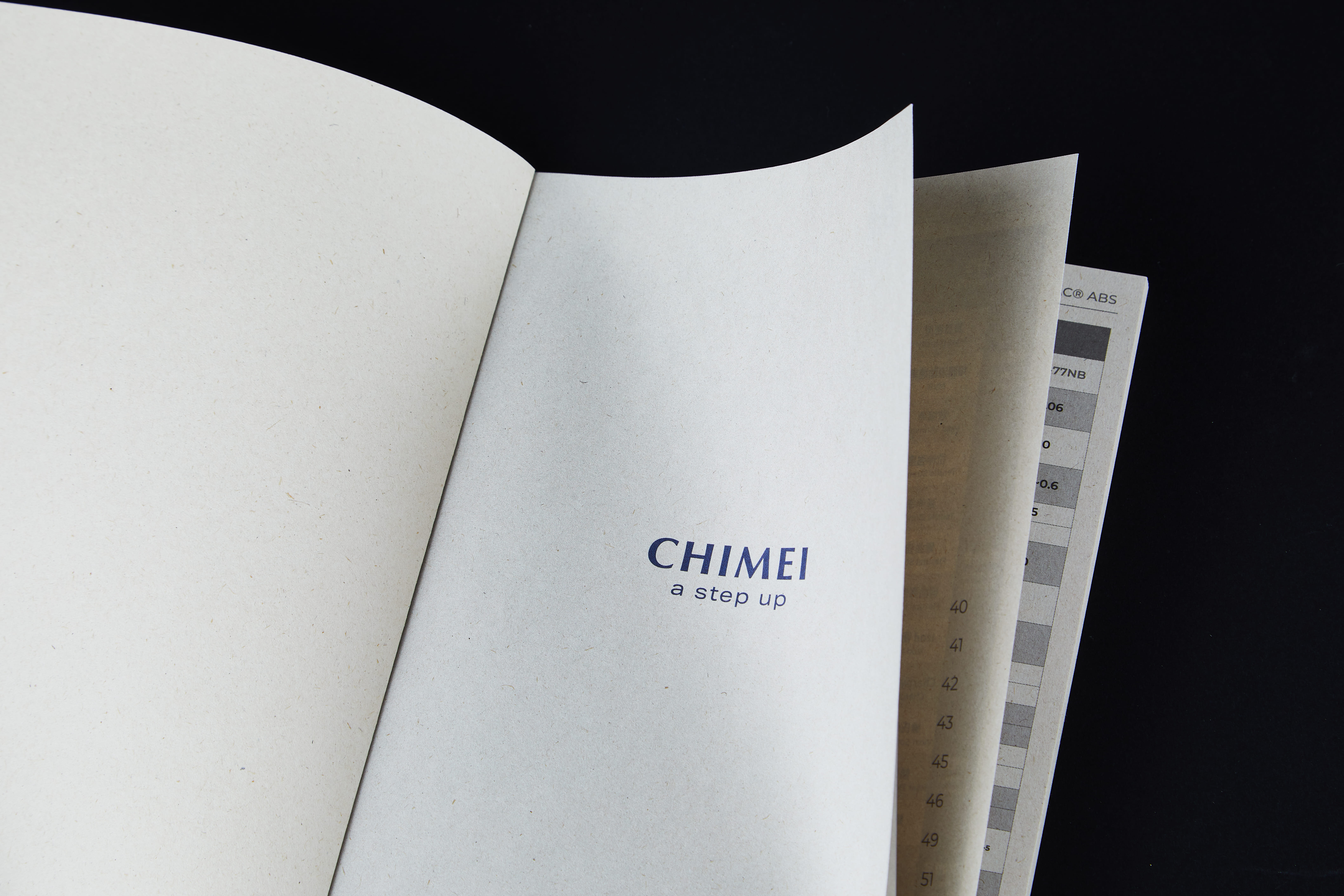
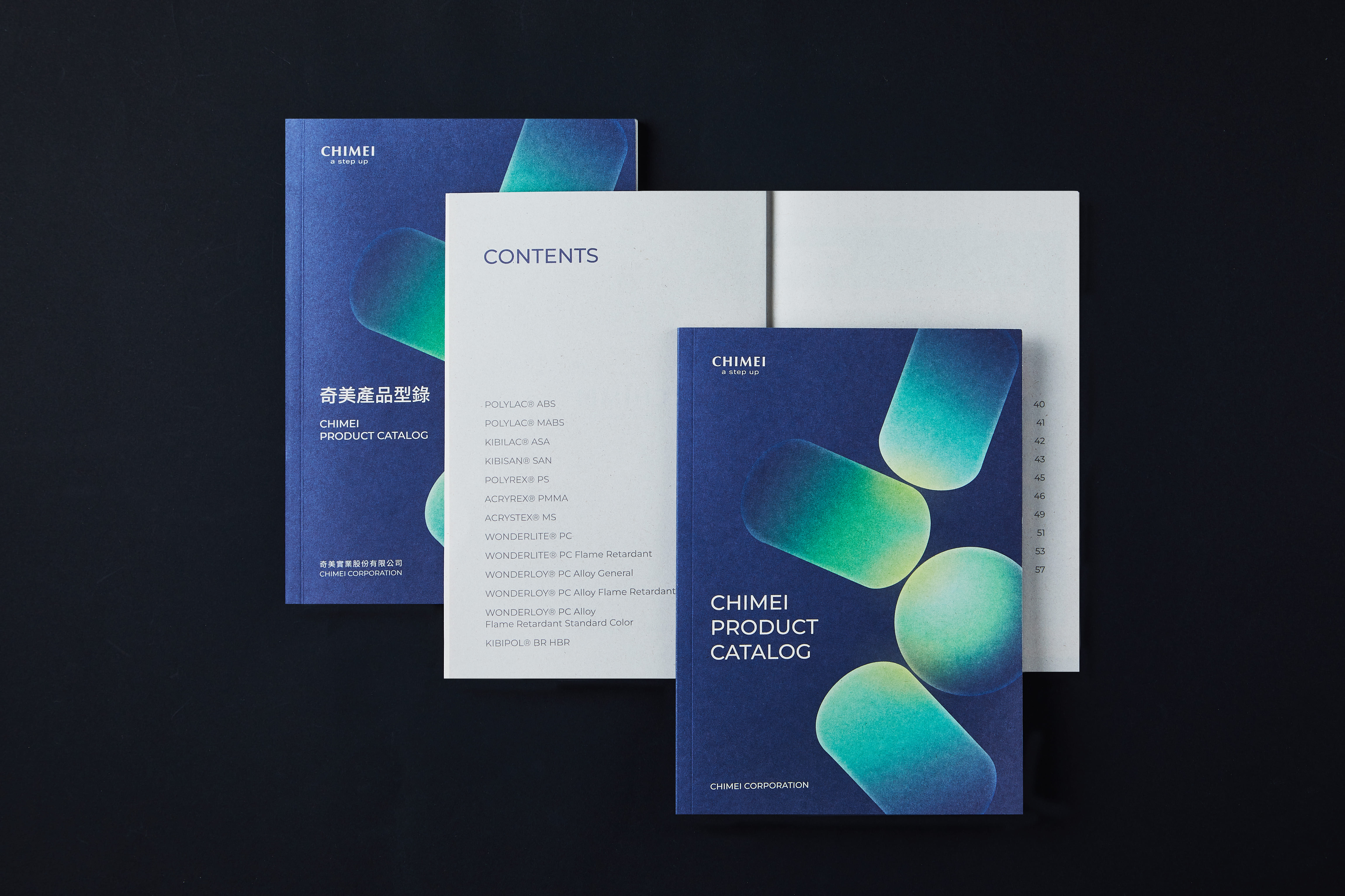
本型錄以材料本質為出發點,將奇美實業專業技術轉化為簡潔而理性的視覺語言。整體以深藍色調結合半透明有機形體,象徵材料的穩定性、延展性與科技感,呈現品牌在創新與精準之間的平衡。印刷材質選用蔗素紙,其自然纖維質感與低反光特性,提升大量技術資訊的閱讀舒適度,同時傳達對環境永續的重視。視覺設計與用紙選擇相互呼應,使型錄在專業呈現與品牌價值之間,建立一致而成熟的整體形象。
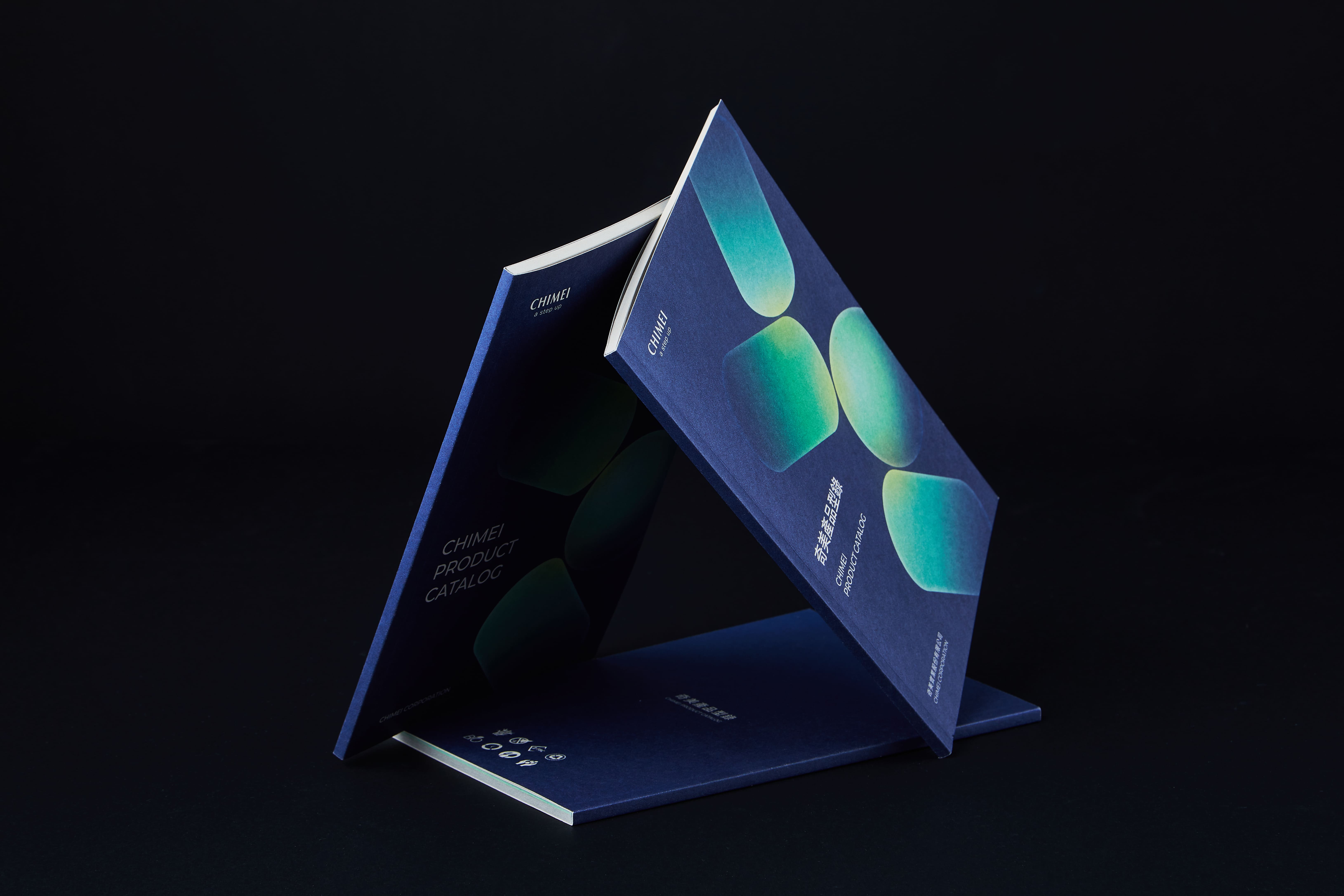
This catalog is developed from the intrinsic qualities of materials, translating CHIMEI’s technical expertise into a clean, rational visual language. The overall design adopts a deep navy palette paired with semi-transparent organic forms, symbolizing material stability, flexibility, and technological sophistication. It reflects the brand’s balance between innovation and precision.
For print production, bagasse paper was selected for its natural fiber texture and low-glare surface, enhancing readability across information-dense technical content while reinforcing the brand’s commitment to sustainability. The visual system and paper choice work in harmony, building a cohesive and mature identity that aligns professional communication with CHIMEI’s brand values.