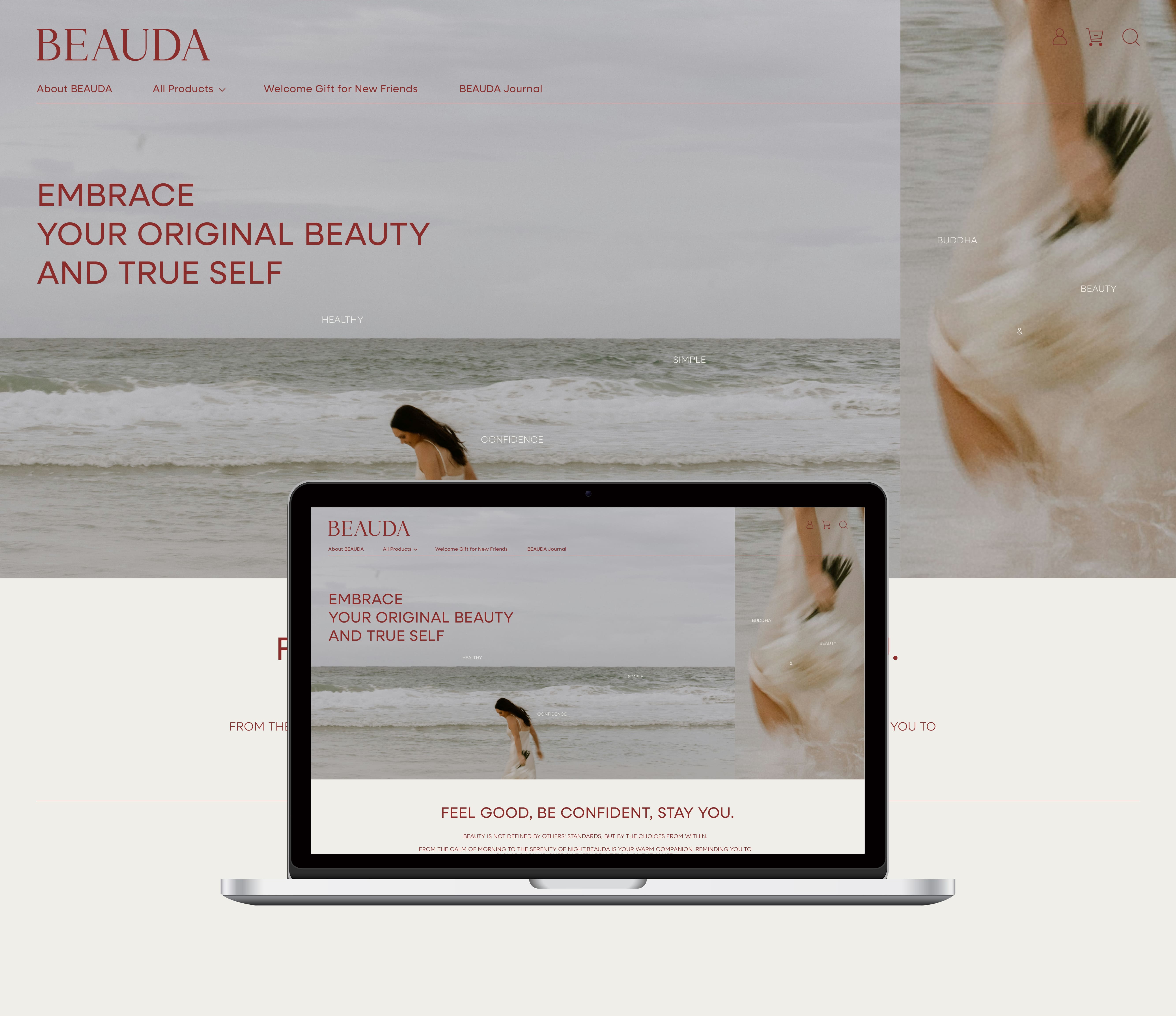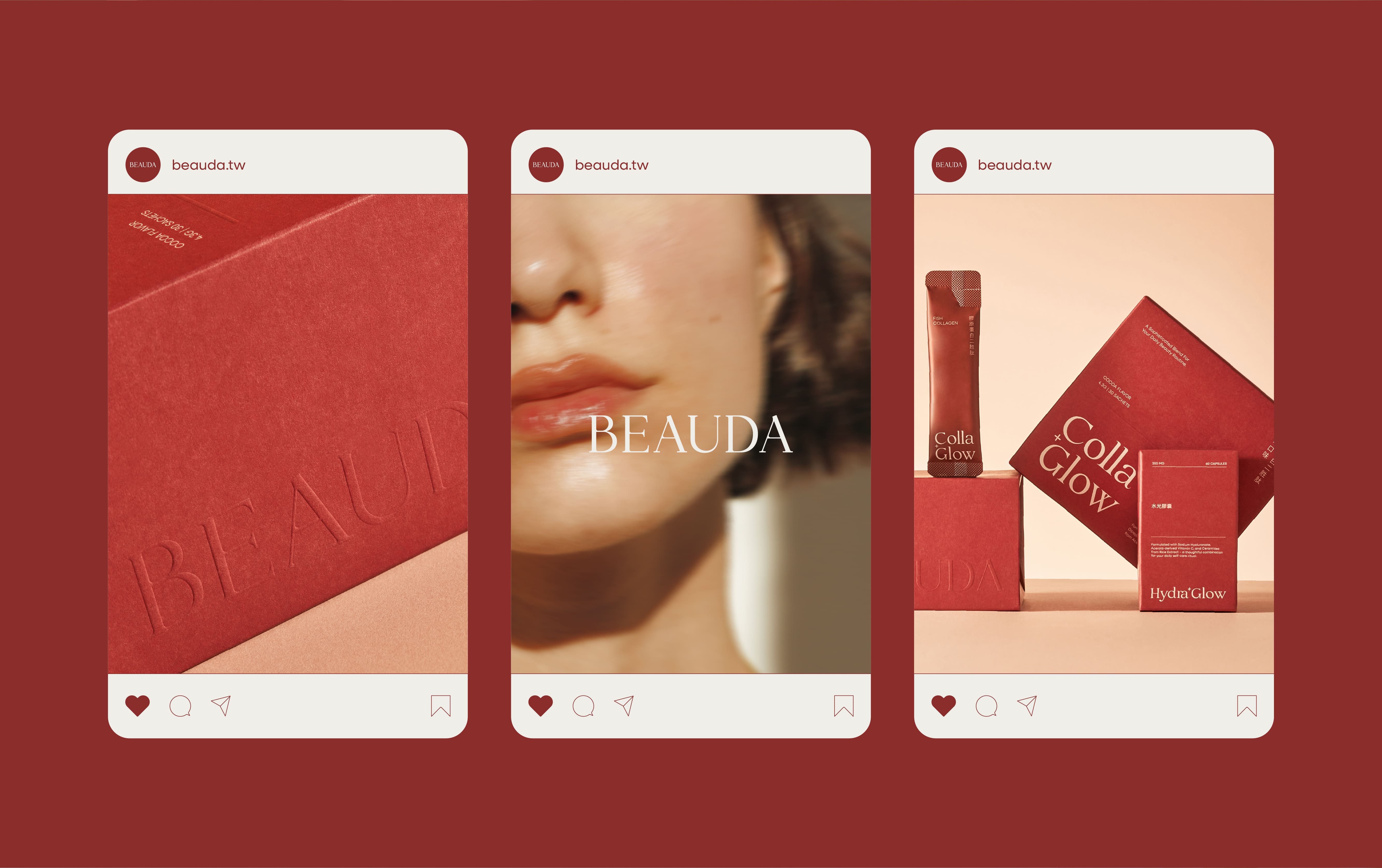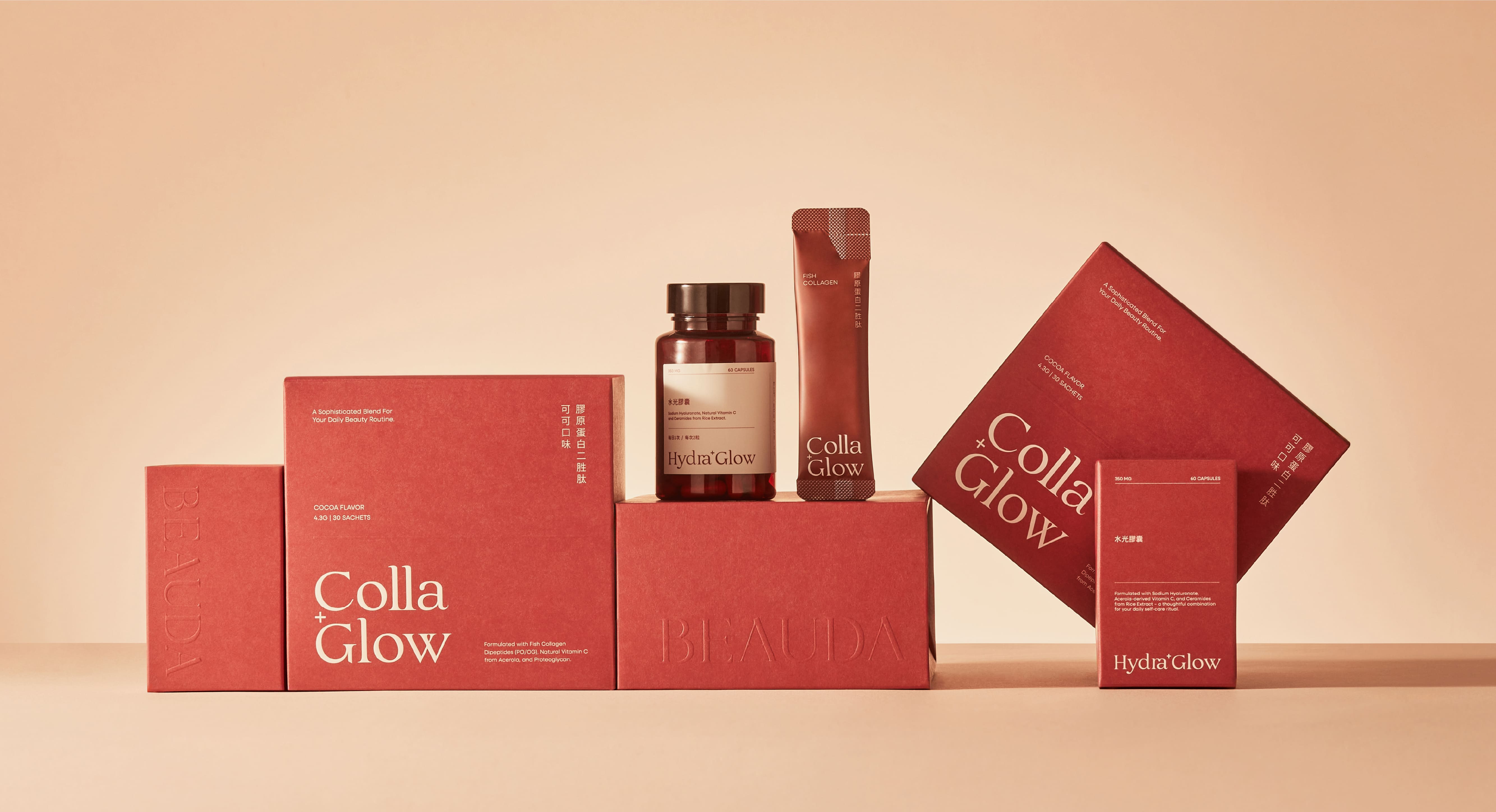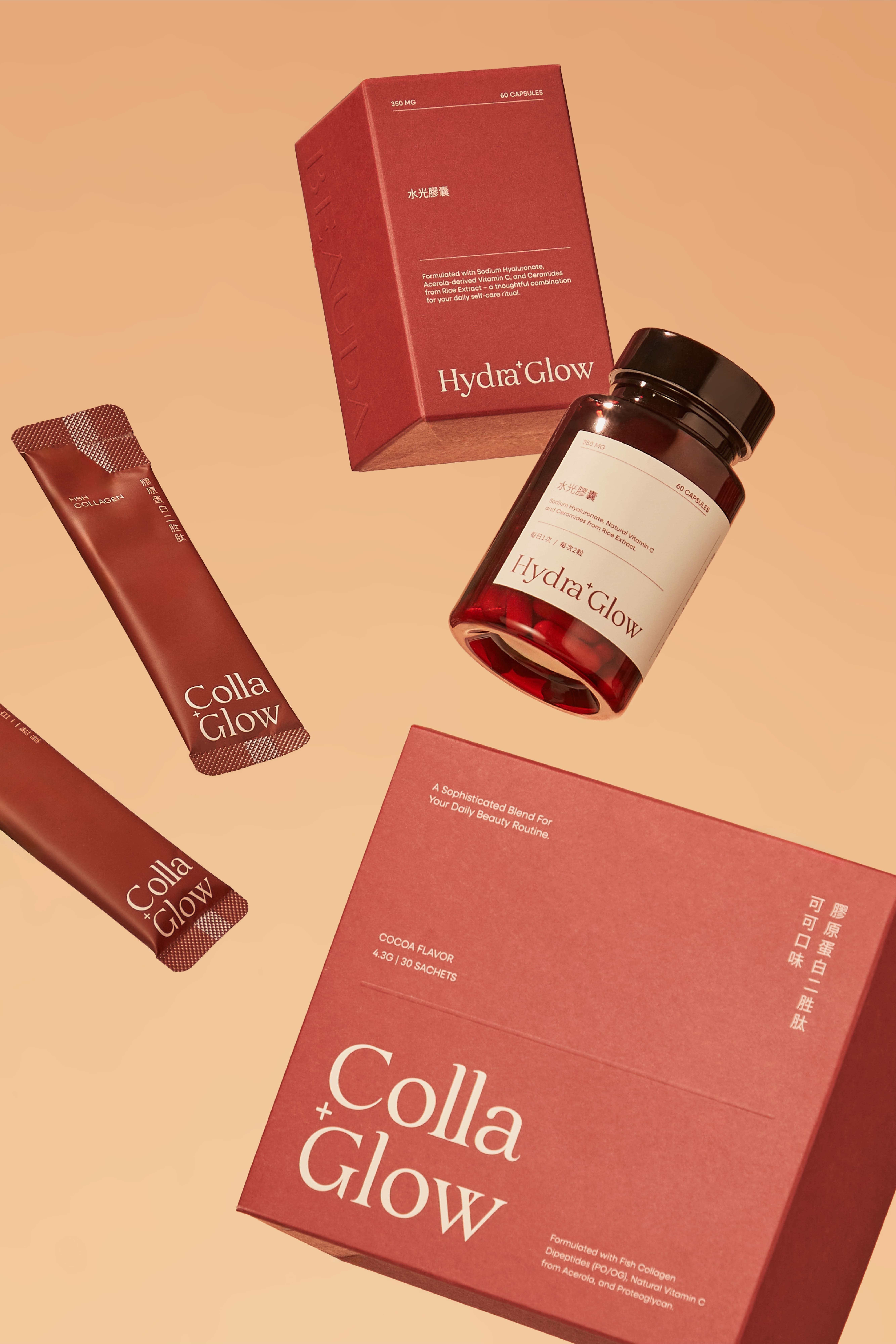
Beauda結合了“Buddha”的智慧與自覺,以及“Beauty”的自信與美麗,期待每個人能在快速變動的世界中,放緩腳步、好好擁抱自己最初始的美。Beauda標誌結構上,我們重新梳理每一個字母的比例與線條關係,使整體視覺更佳穩定而自信;不刻意強調力量,卻能長時間被注視。在圓角與直角之間取捨,刻意保留柔軟與理性之間的平衡。圓角不追求甜美,而是讓線條更貼近真實肌膚的觸感;由直線維持清晰結構,使字形在極簡中仍保有內在張力。在筆畫粗細與轉折處,我們避免過度修飾,讓線條在細節中保留呼吸感與留白,象徵 BEAUDA 對「不過度添加」與「真正有益」的堅持,整體收斂了多餘曲度,使外型更為內聚、節制。BEAUDA 所相信的美,不來自外界標準,而來自對自身狀態的理解與覺察。安靜而穩定的存在感,不急於被看見,卻能長久陪伴。“ Feel good, be confident, stay you. “
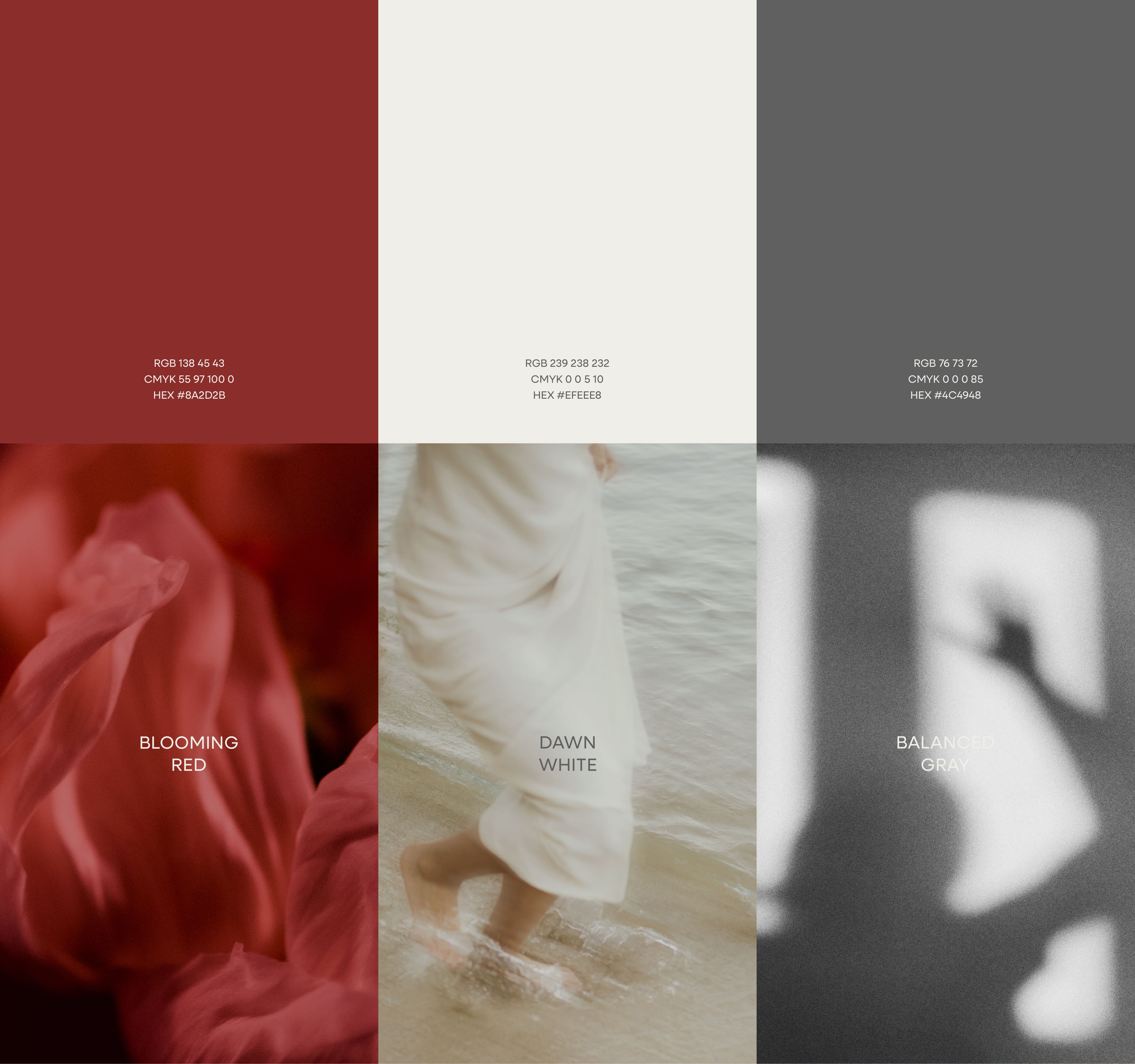
Beauda brings together the wisdom and awareness of “Buddha” with the confidence and beauty of “Beauty,” inviting everyone to slow down in a fast-changing world and reconnect with their most original sense of beauty.
For the Beauda logotype, we refined the proportions and relationships of each letterform to achieve a more stable and confident visual presence. It does not seek to appear forceful, yet remains quietly compelling over time. By balancing rounded and straight edges, the design retains an intentional tension between softness and rationality. The rounded corners are not meant to feel sweet, but to bring the strokes closer to the tactile reality of skin. The straight lines preserve structural clarity, allowing the logotype to remain minimal while holding an inner strength.
In the weight, curves, and transitions of each stroke, we avoided excessive embellishment. Instead, we preserved breathing space and quiet restraint within the details, reflecting BEAUDA’s belief in “no unnecessary additives” and “only what truly benefits.” By reducing redundant curvature, the overall form becomes more cohesive and disciplined.
BEAUDA believes beauty is not defined by external standards, but shaped through self-awareness and understanding. A presence that is calm and steady, never rushed to be noticed, yet always there to stay.
“Feel good, be confident, stay you.”
